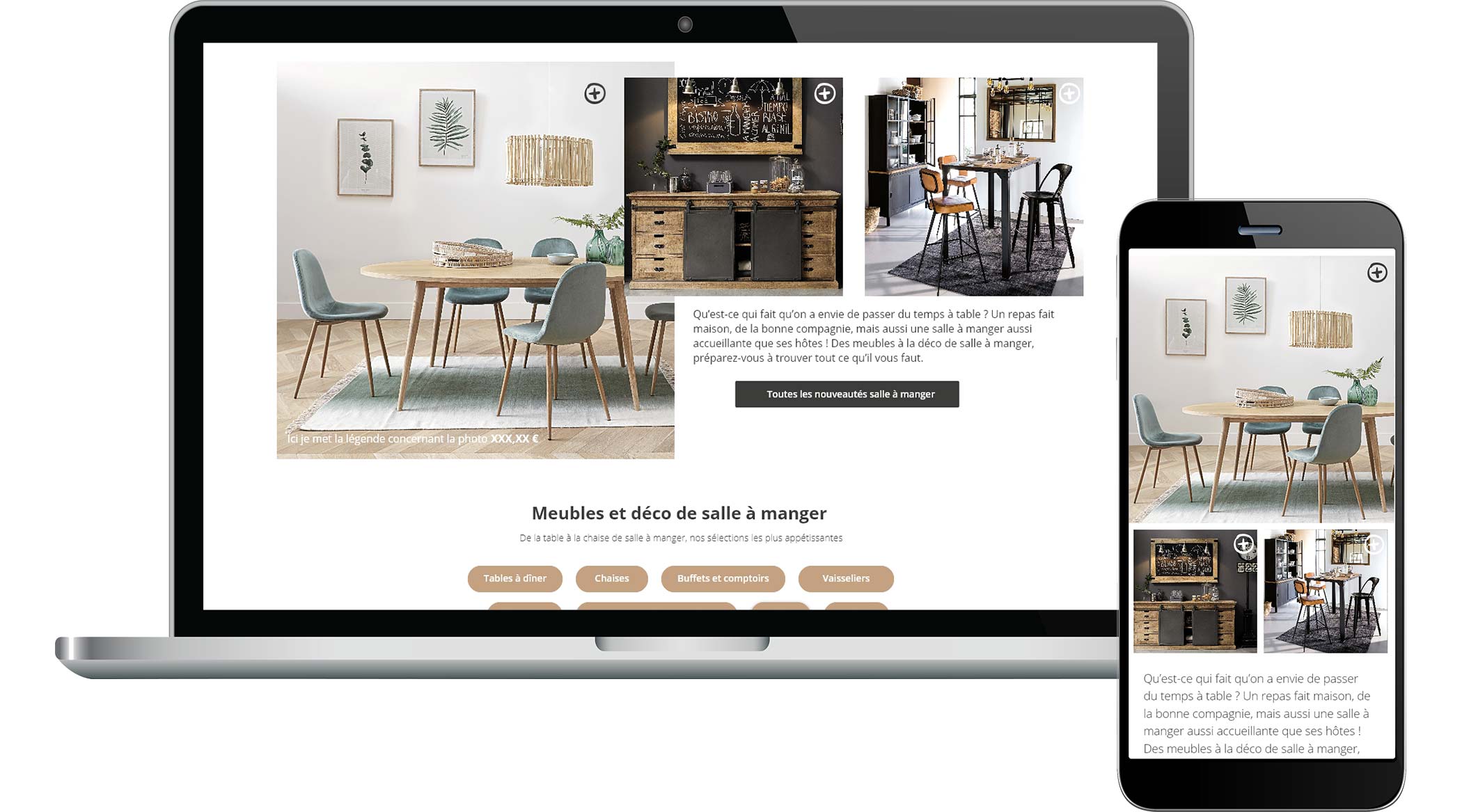
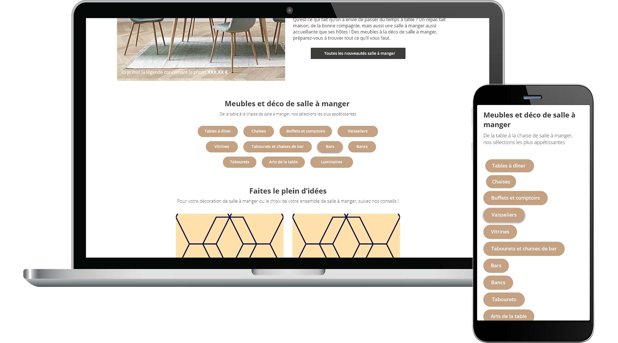
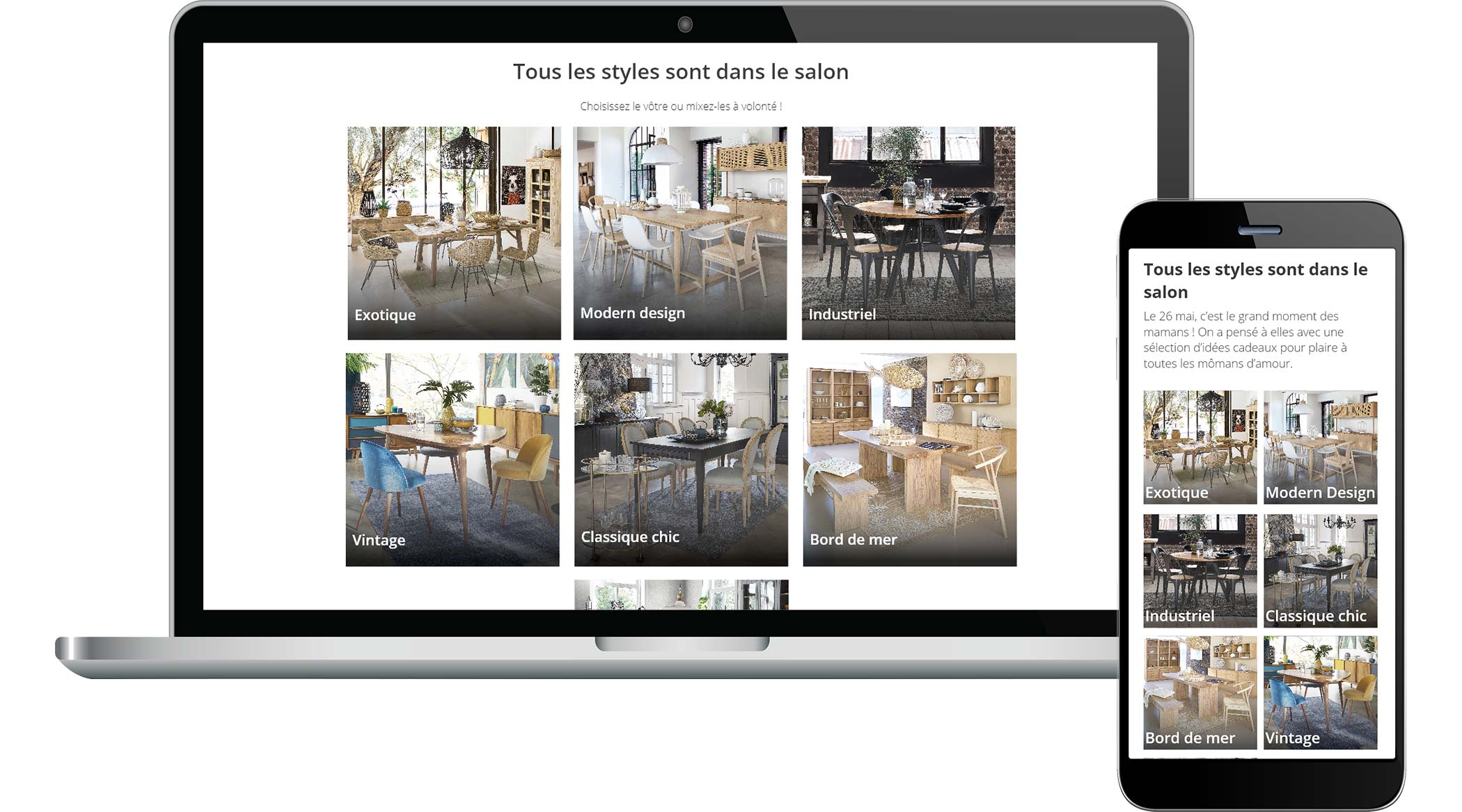
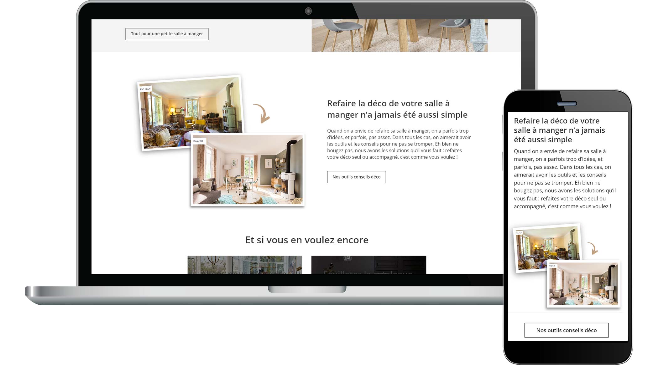
I worked about 4 years for the digital headquarters of this furniture and decoration sales company. My main role was UI designer but I also worked on the graphic part of advertising campaigns (banners, newsletters, landing pages, …). As a UI designer, my role was to modernize certain parts of the website from the new graphic charter as well as adapt it to responsive design: redesign of b2b pages, redesign of the purchase tunnel, redesign of the account page , improvement of the single product page, redesign of the filters part of the product pages, improvement of the product category page. I also worked on the graphic part of the web application allowing you to customize your sofas.

Purchase tunnel
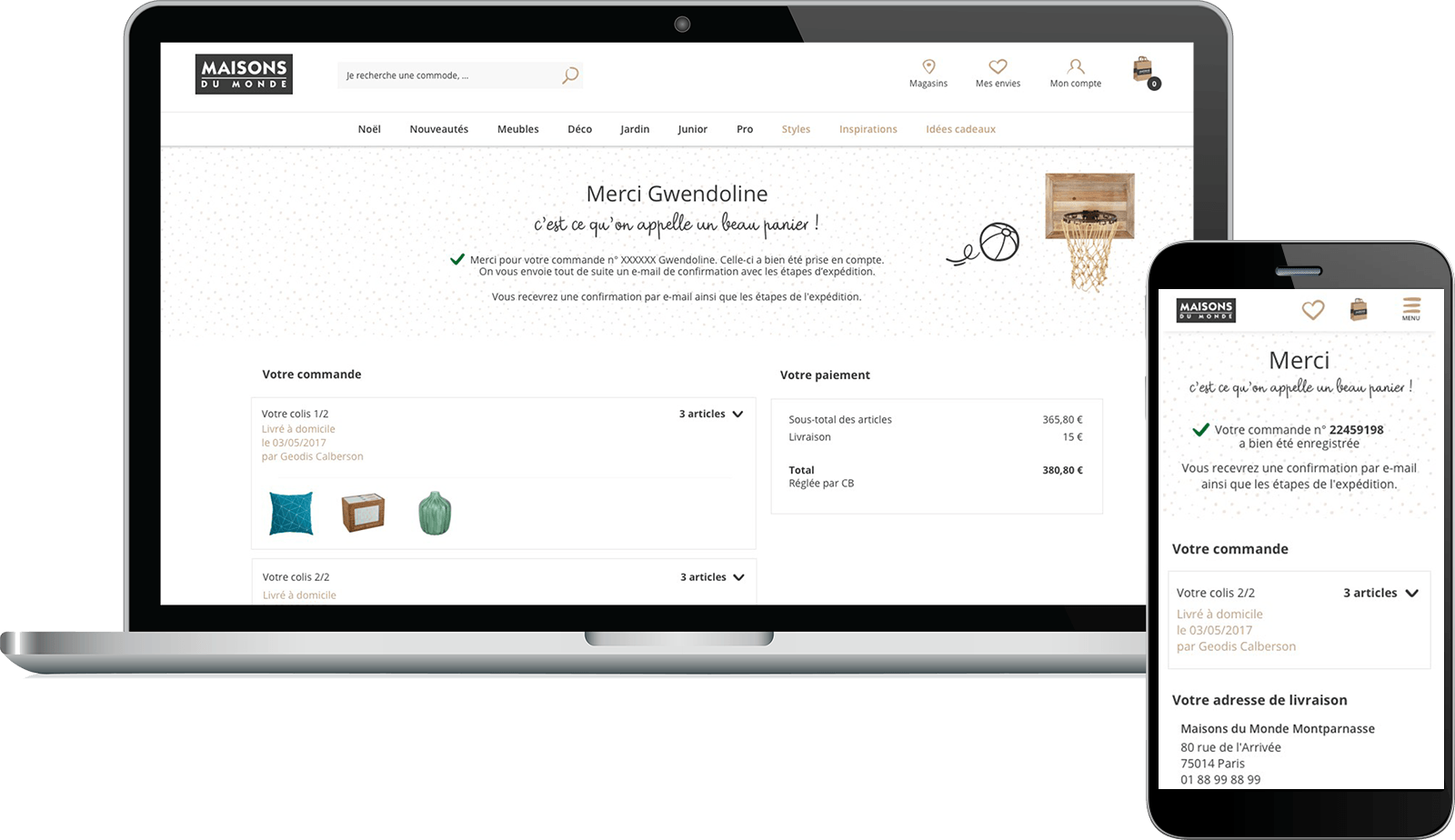
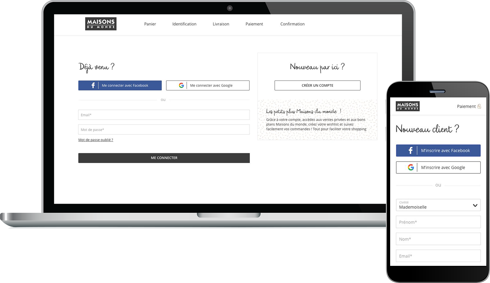
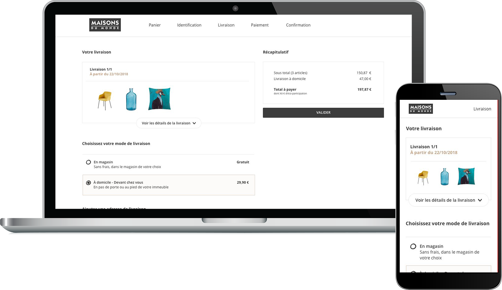
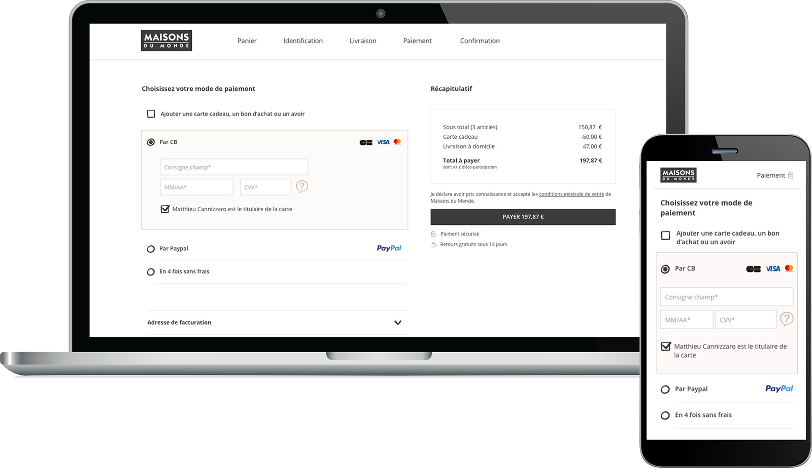
The buying tunnel was one of the most complex parts to achieve. Indeed, when a customer orders several products, it is possible that each of these products will be delivered by different carriers. A small decorative object and a large piece of furniture have little chance of being delivered by the same company. In addition to this, some companies offer additional services, such as installing furniture directly in the room of your choice. Finally, depending on the country, the services offered are different. Despite a large amount of information, the goal was therefore to offer clear, intuitive and reassuring navigation for the consumer. He must find and understand information quickly.
Customizable sofas
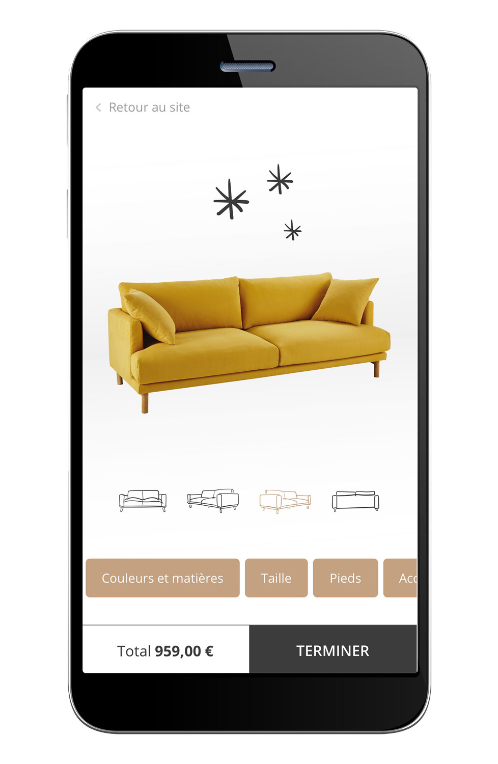
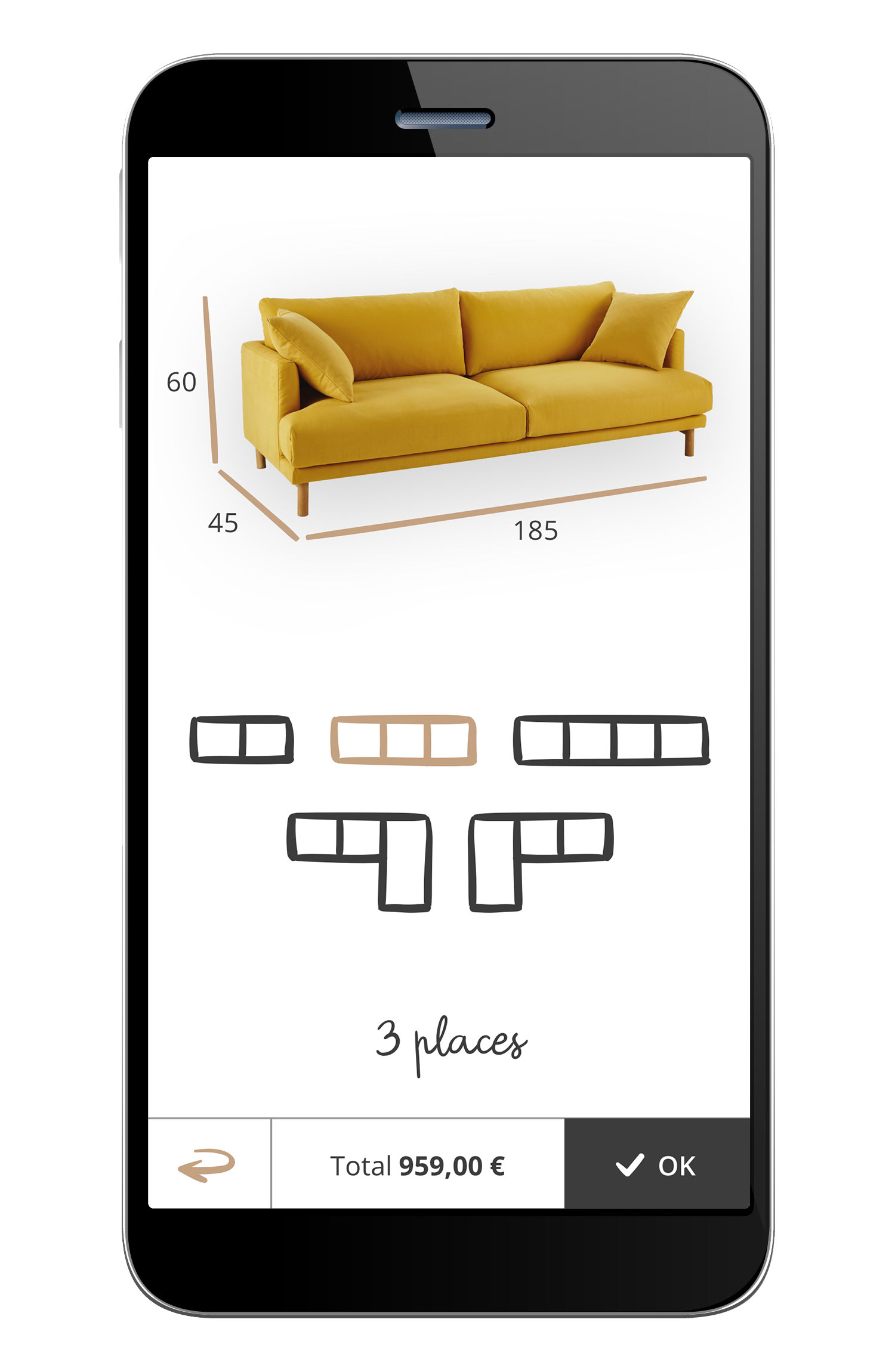
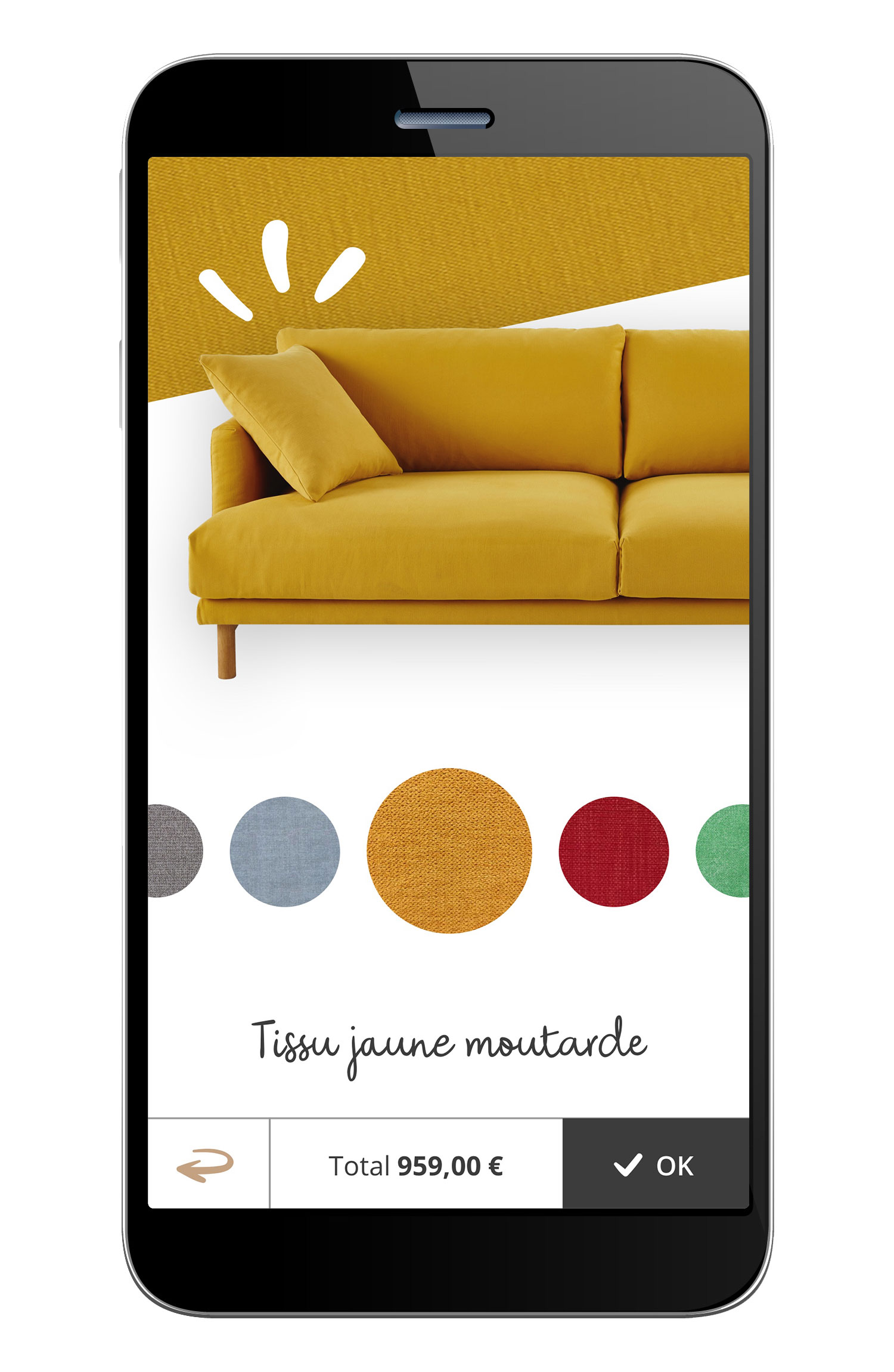
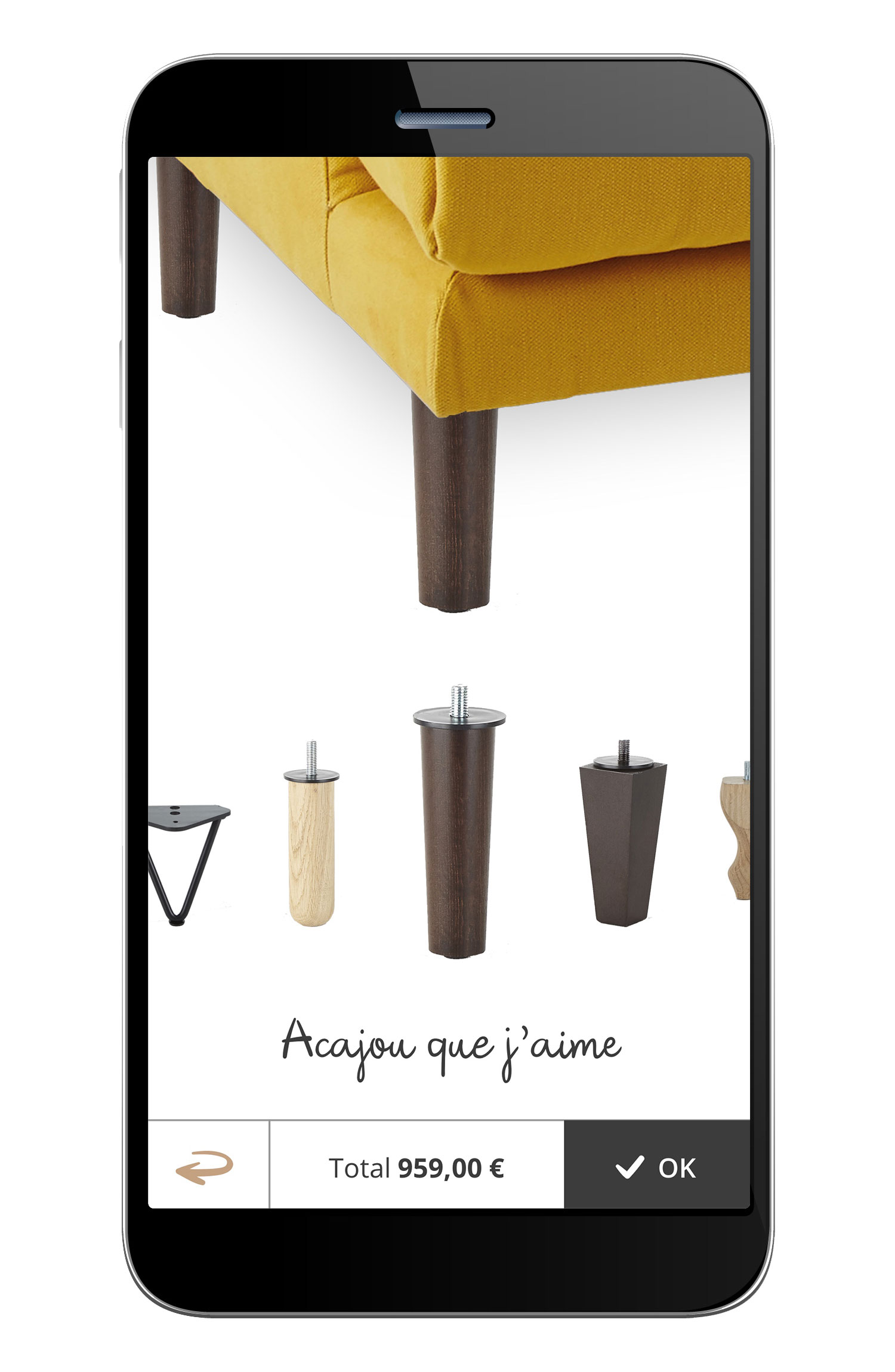
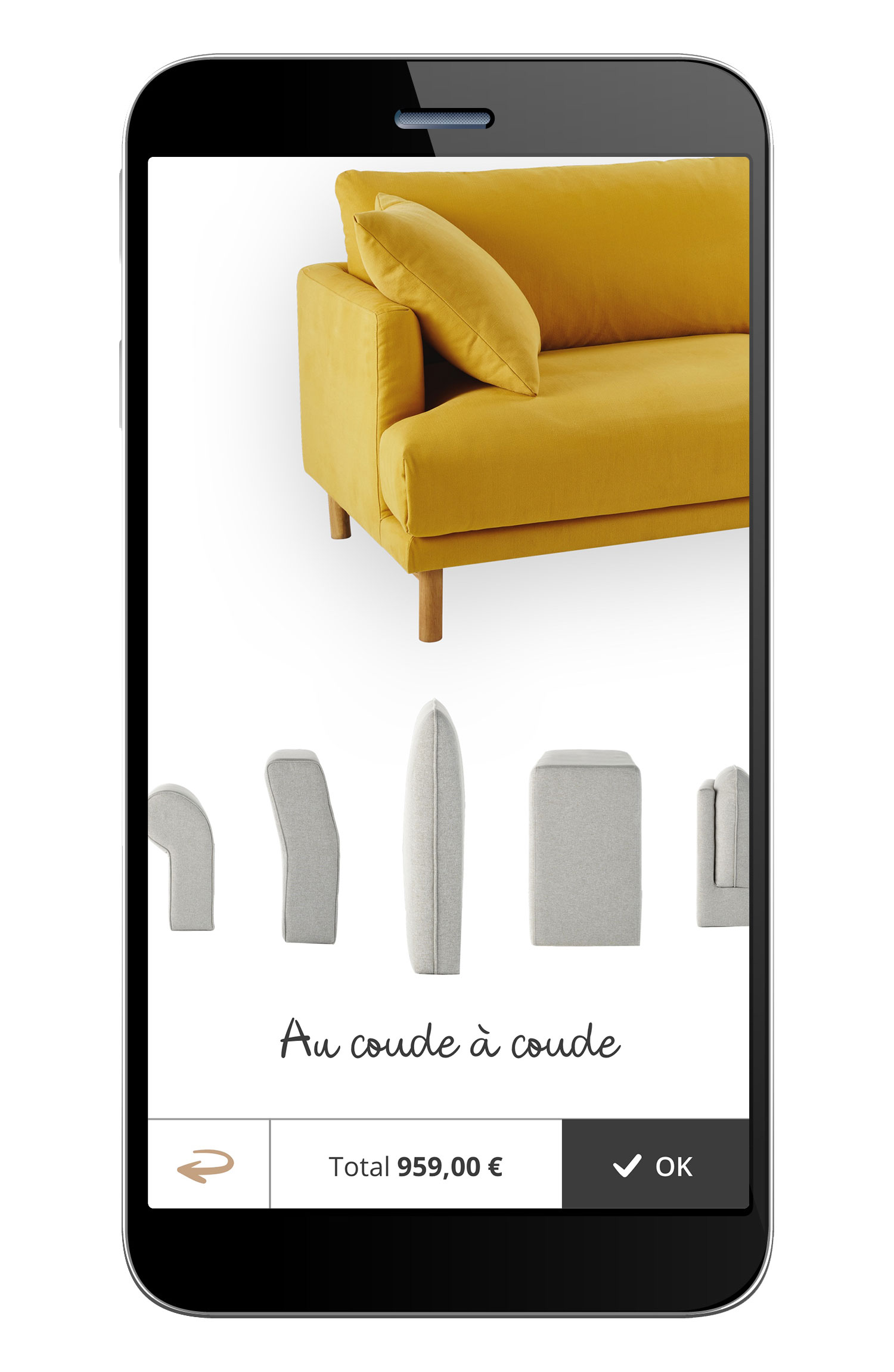
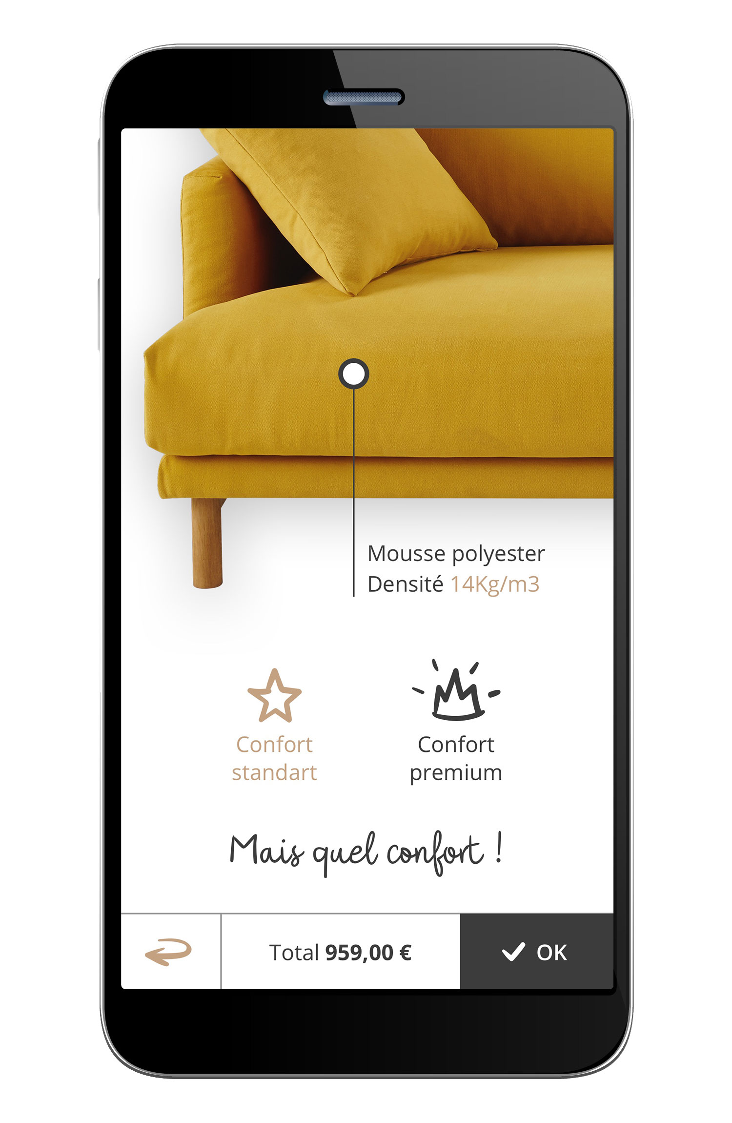
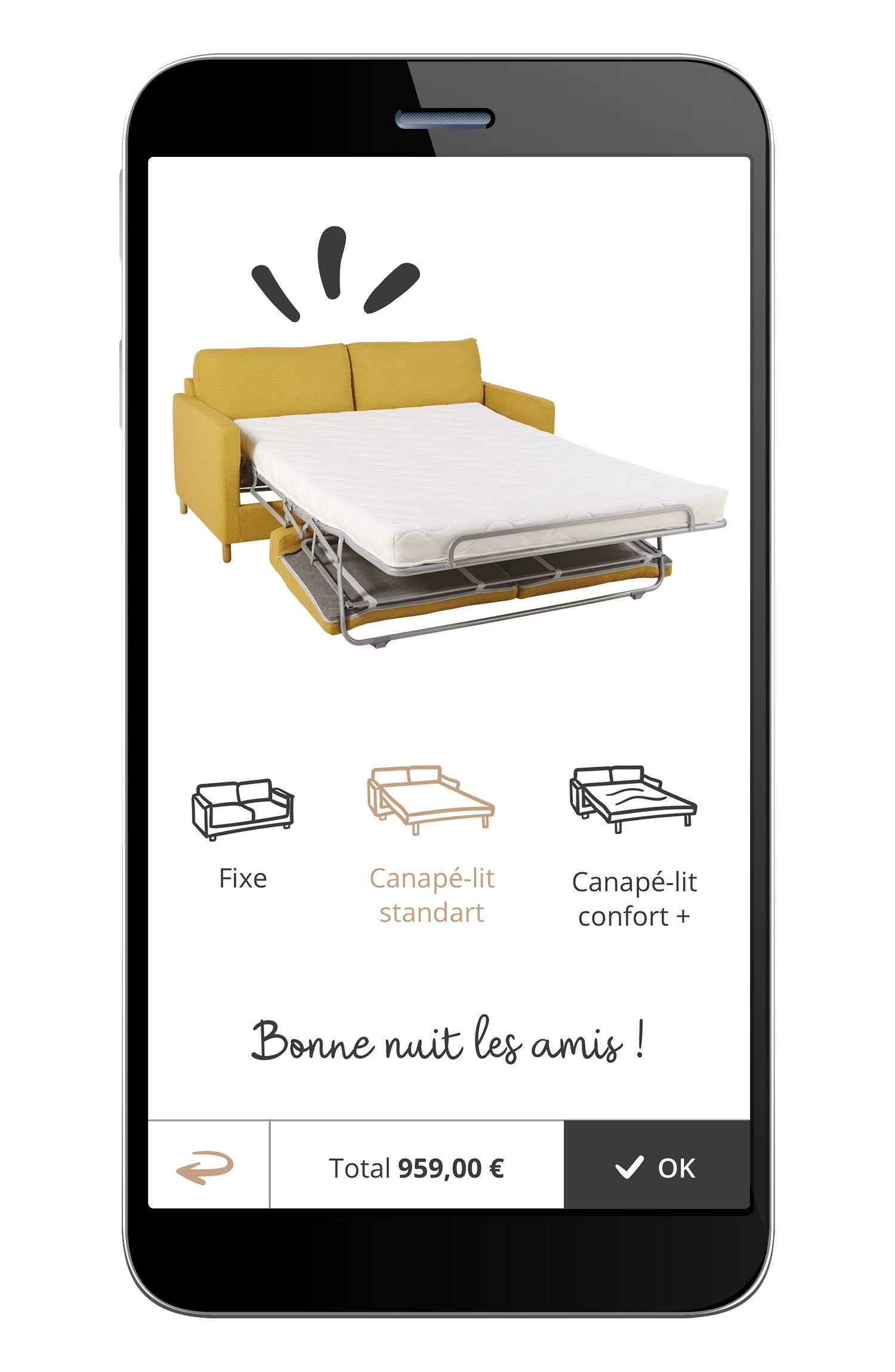
I worked on this web application allowing you to fully personalize your sofa. The user can choose the color, the material, the shape of the legs, the size of the sofas, … The timing being tight, the developers imposed on us as a constraint that the preview of the sofas would be made from images resulting from the 3D rendering already existing. This means that we had to order a number of 3D renderings corresponding to the number of customization possibilities. Of course, we had to multiply this number by the number of views for the web app. My role, in addition to creating the design of the app, was to communicate the exact angles of the preview views.
Modular design
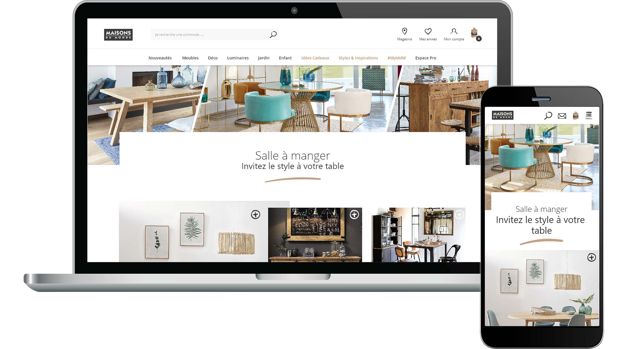
A global overhaul of a website as big as this one (around 15,000 products and different services for everyone: b to b, b to c) is a gigantic job. After several redesigns of page types, we have therefore isolated several recurring module types in order to reuse them throughout the site. A module is a block comprising several elements (such as a molecular component in Sketch composed of atoms): title, text, images, buttons, … This has allowed us to speed up the creation of new pages both at the design level and at the programming level.
Example of simulation
From Sketch and Adobe After Effects mockups, I sometimes do little animations like this to help programming engineers understand the customer journey. This step is mandatory if the elements are animated in an unusual way in the page.


